Quillo
Naming, branding, and launching a digital lender from the ground up
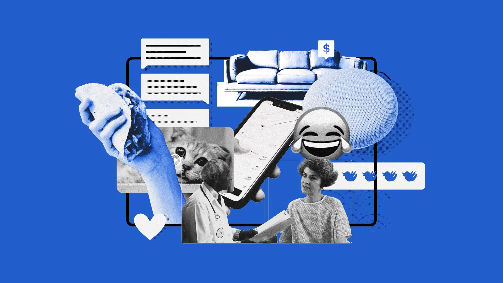

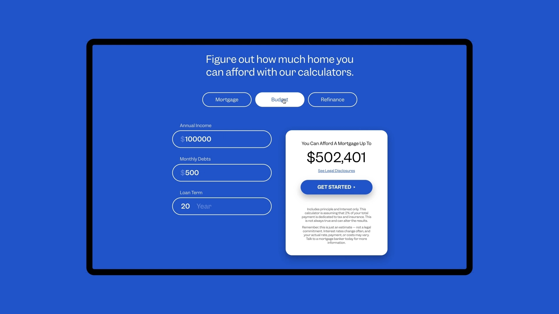
The mortgage industry has split in two. On one side, local banks with handshakes and relationships. On the other, all-online lenders promising near-instant pre-approvals with no human in sight. Most borrowers want both — the speed of digital and the confidence of expertise. Quillo was built to deliver exactly that, and they challenged us to build the brand from the ground up.
Define
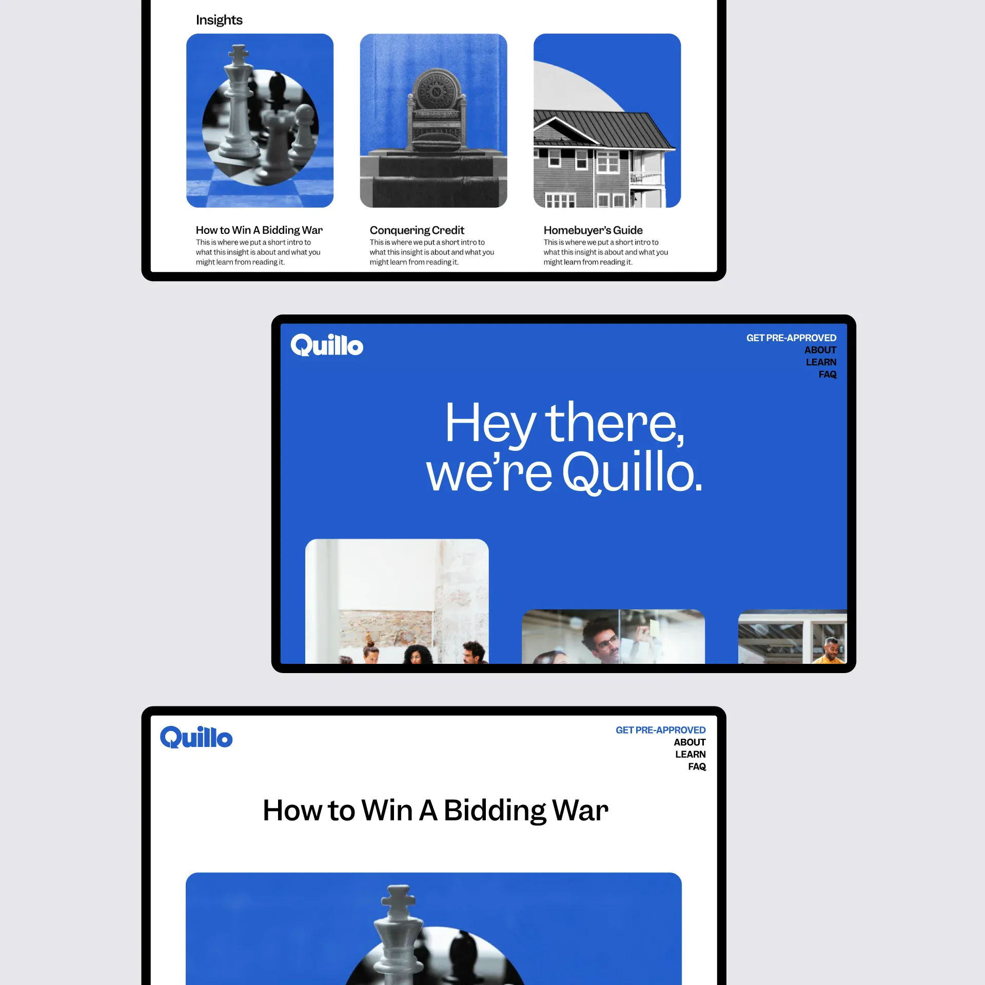
We set clear naming criteria around three things: simplicity, transparency, and a digital-first feel. The name Quillo blends "quick" and "loan" into something simple and snappy — immediately setting the tone for an uncomplicated experience. The tagline followed naturally: human-backed digital mortgages. Six words that capture the whole positioning.
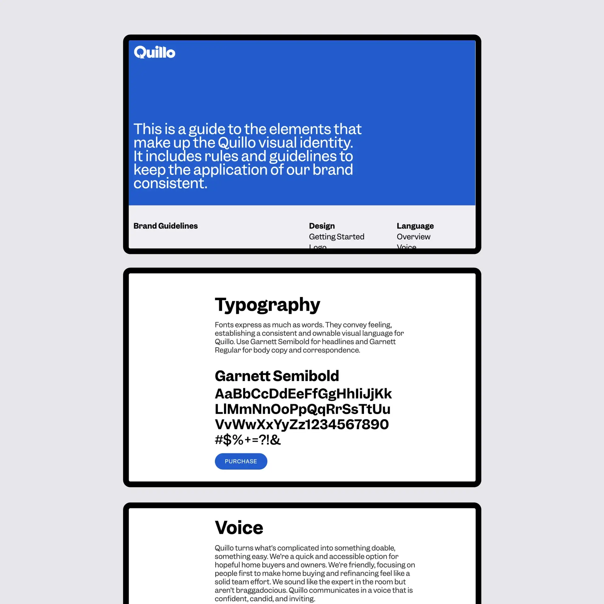
Design
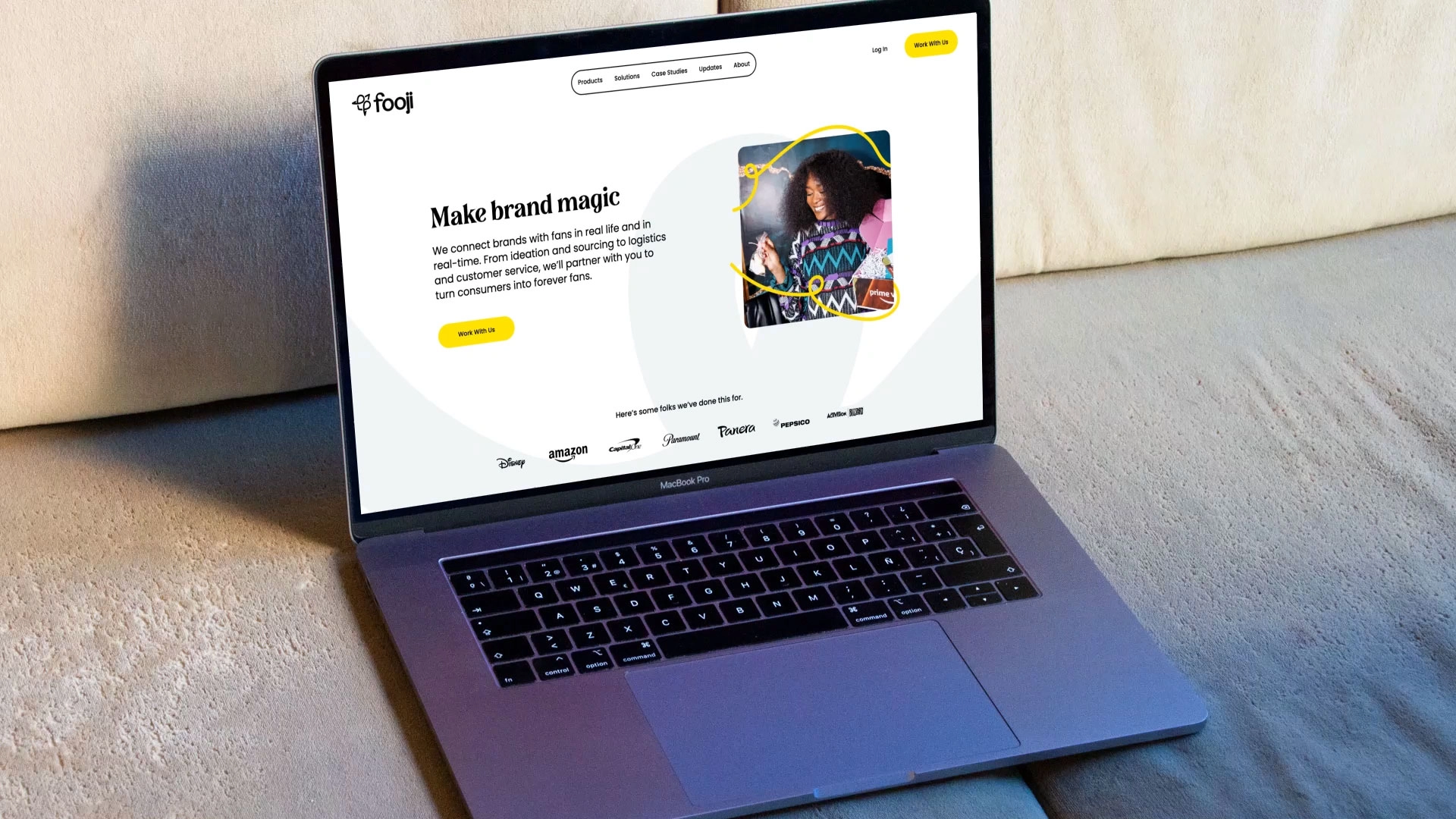
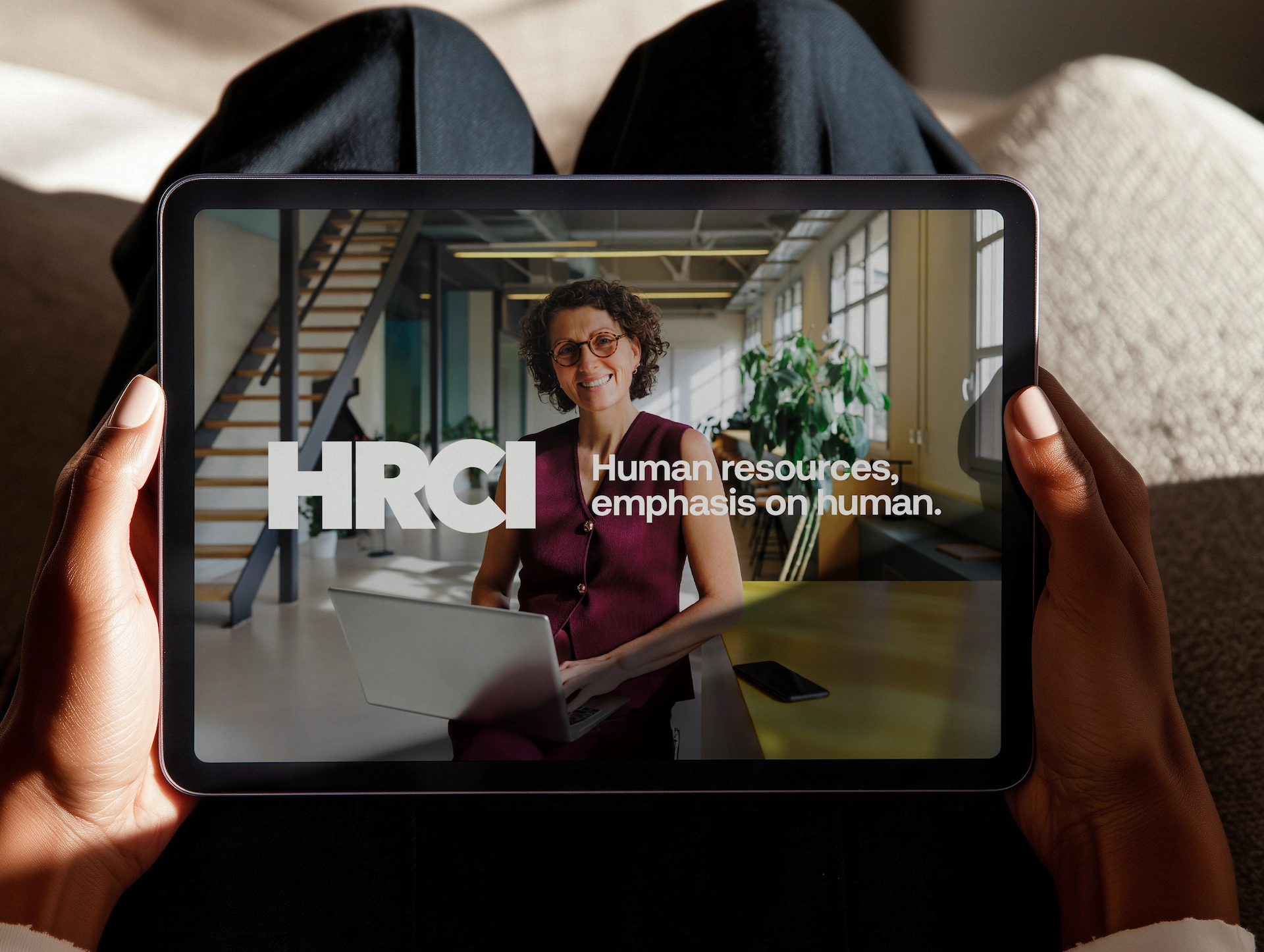
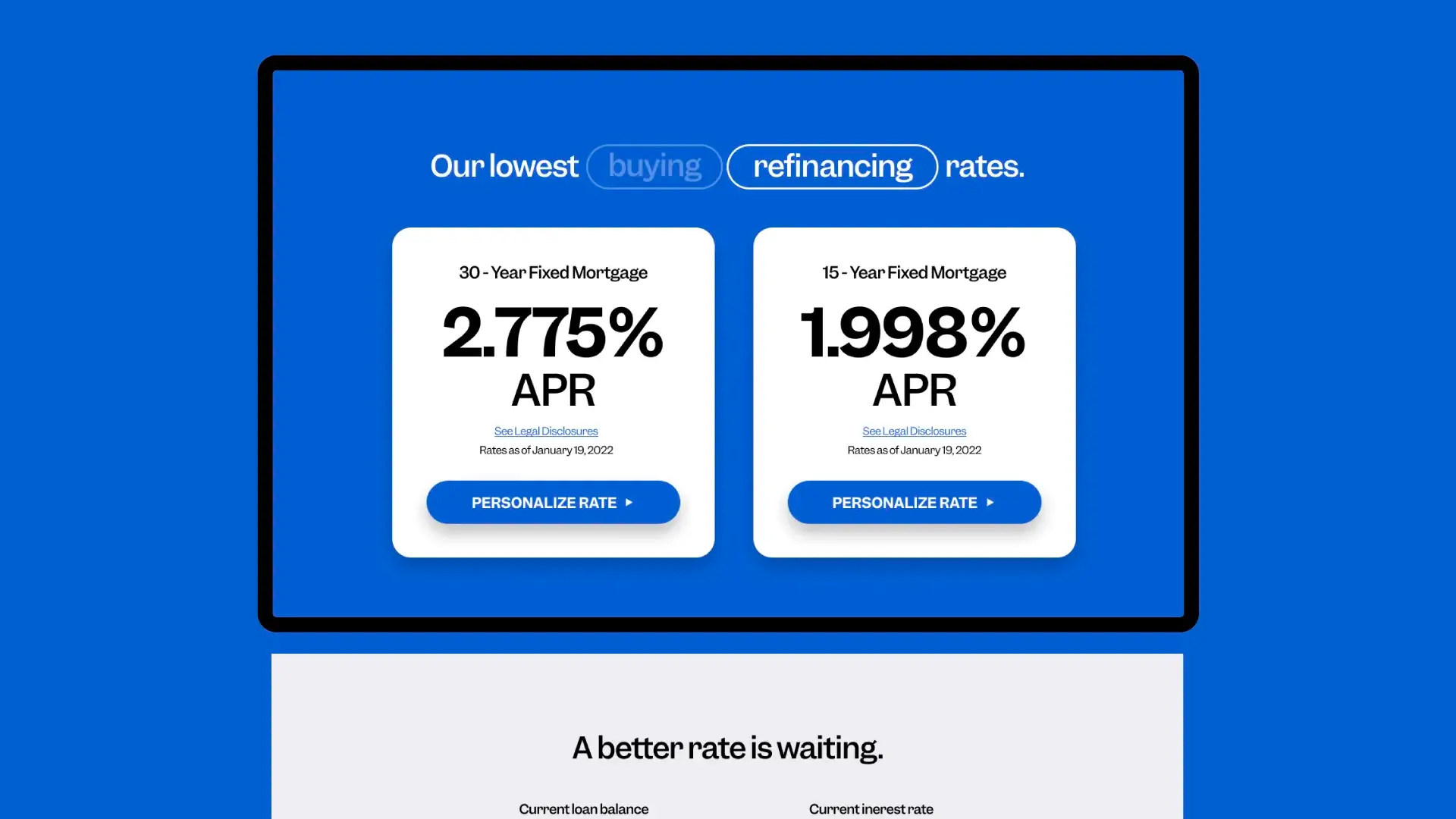
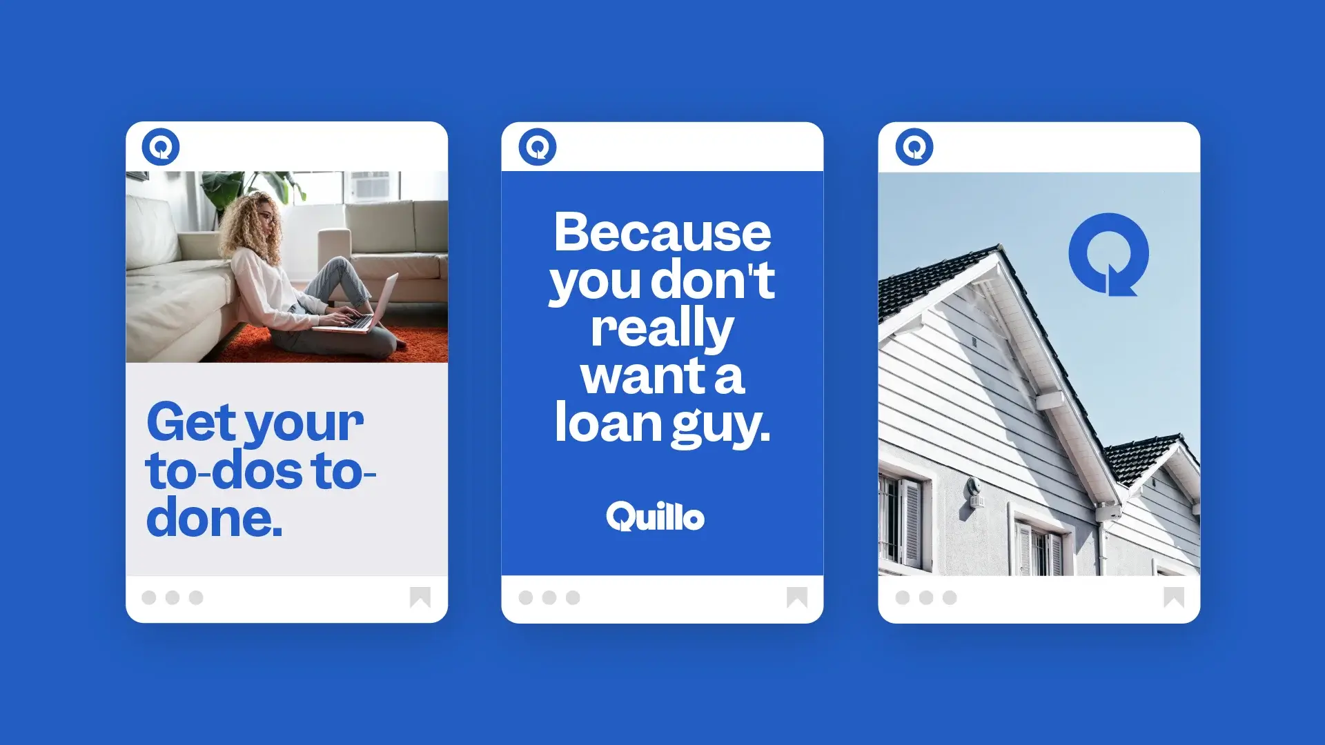
The visual identity reflects the same balance the product promises — clean and digital, but warm enough to acknowledge that buying a house is one of the most human things a person can do. The brand voice carries that same duality: direct and efficient, but never cold. It speaks to the reality of the mortgage process without making it feel more stressful than it already is.
Deliver
From naming to launch, every piece of the Quillo brand reinforces a single idea: you shouldn't have to choose between fast and human. The brand gave Quillo the foundation it needed to enter a crowded market with a clear point of view — and a name people actually remember.
.webp)